
Colliers Packaging
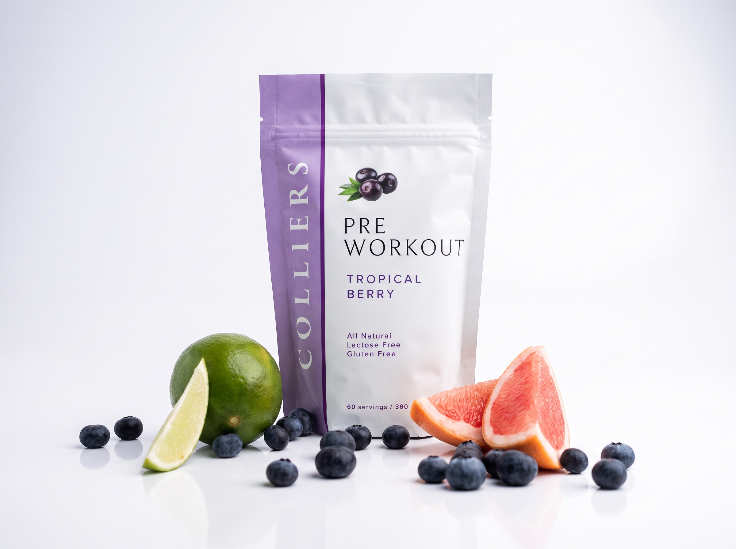
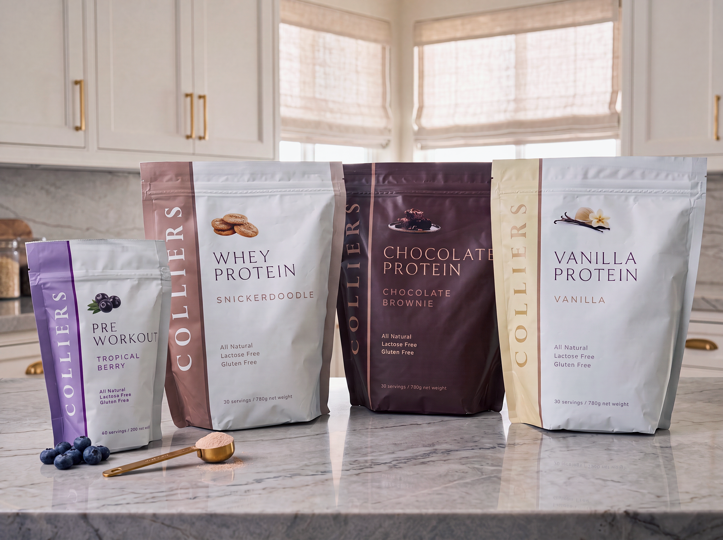

Fresh work! Here is the new packaging design system created for Collier’s protein powder lineup. The project spans four delicious variations: Chocolate Brownie, Snickerdoodle, Vanilla, and Tropical Berry. My main goal was to build a cohesive, modern visual identity that stands out on the shelves while giving each flavor its own distinct personality.
The Moxie Brand

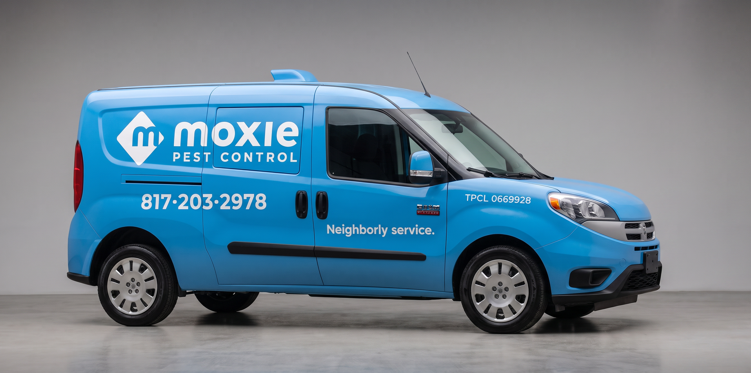
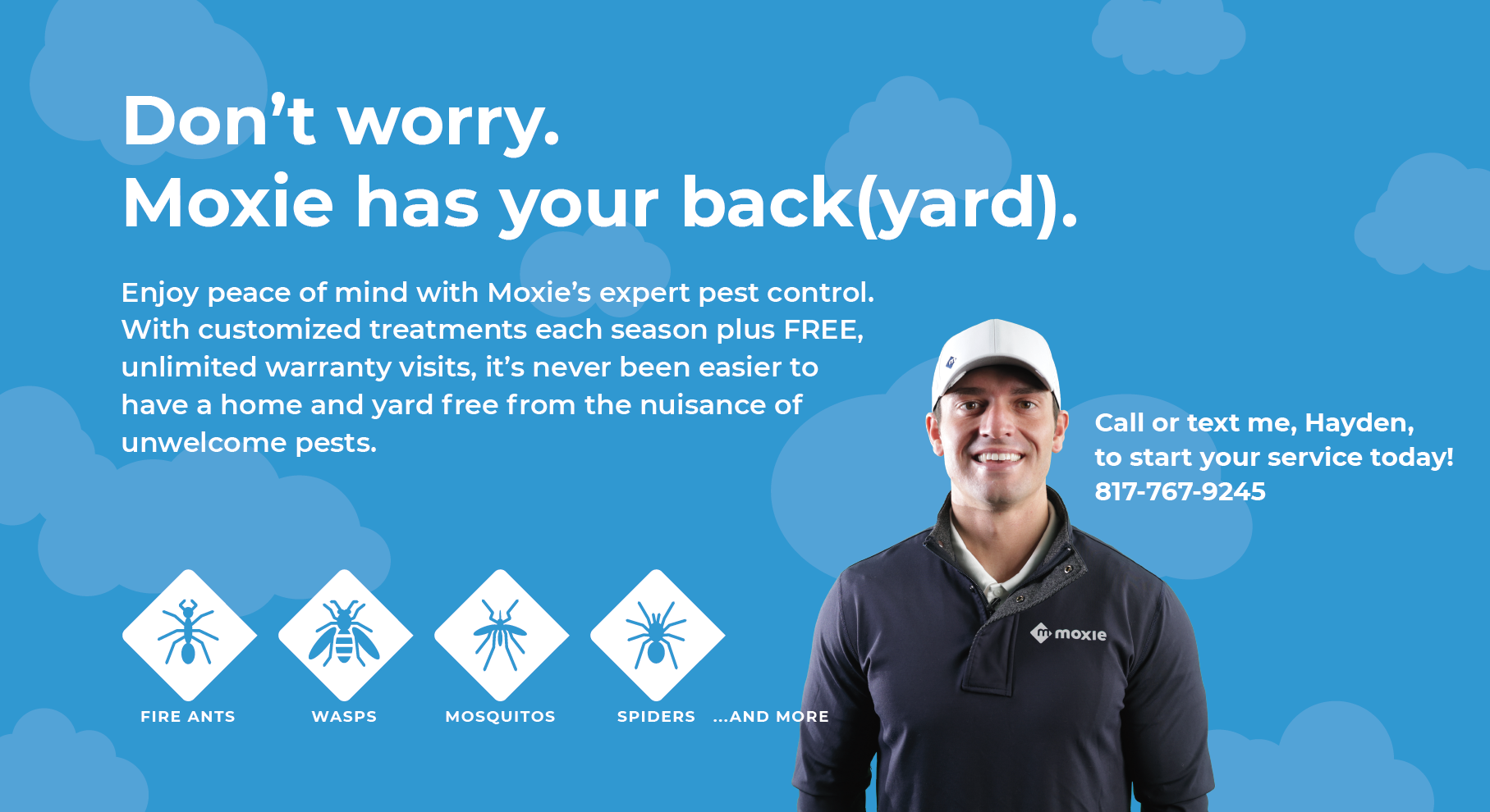
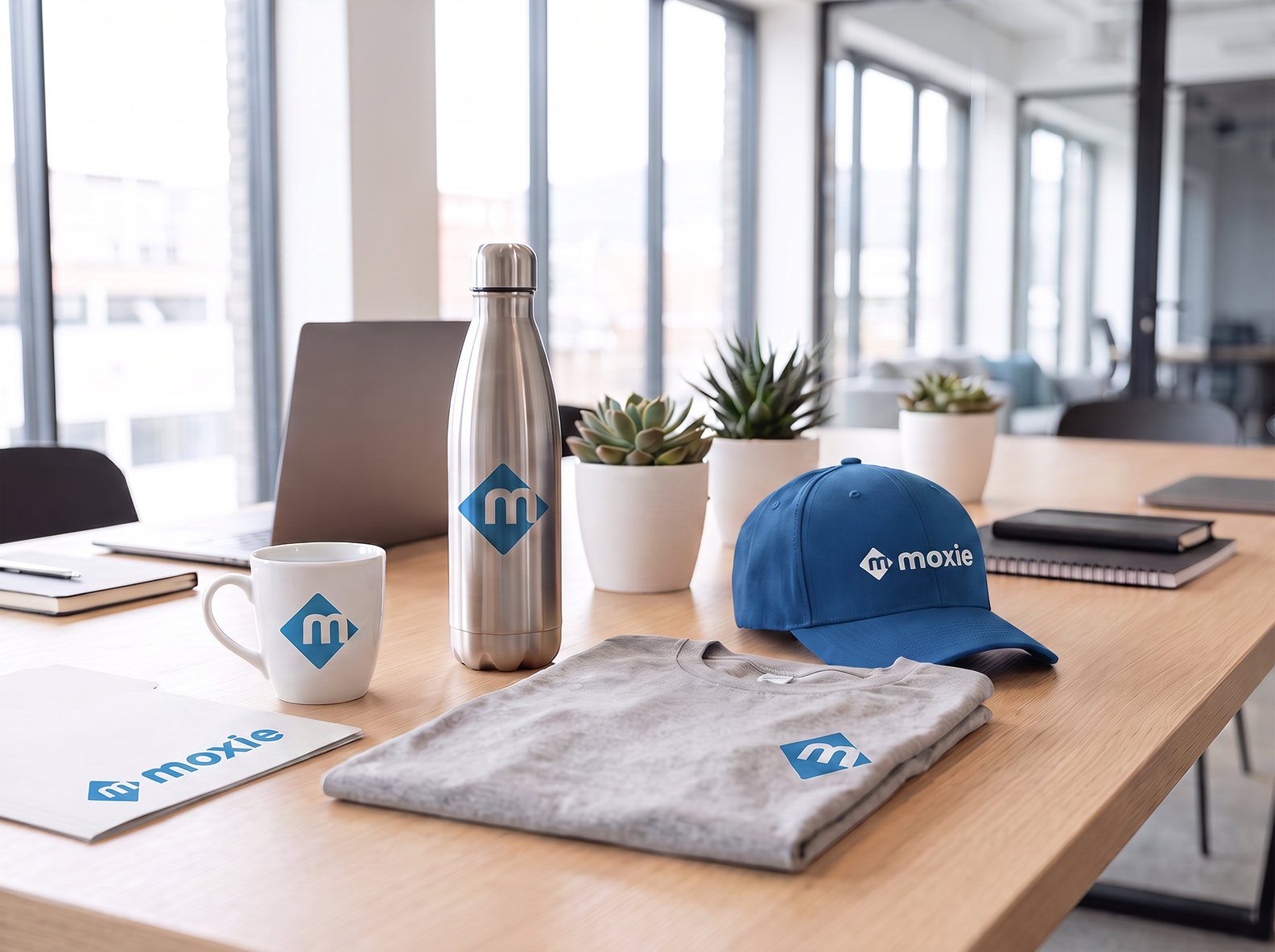

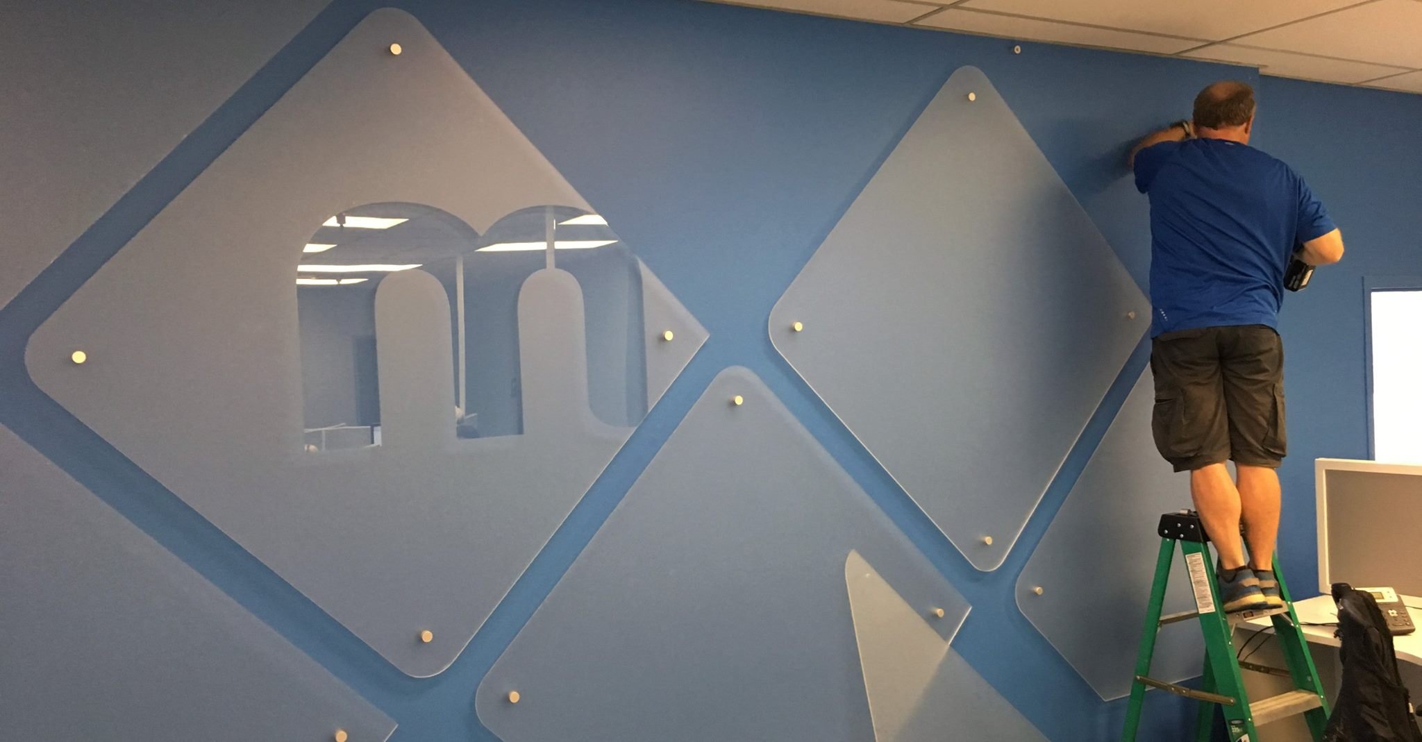
This comprehensive nationwide rebranding for Moxie Pest Control transforms a dated identity into a modern, authoritative industry leader. Replacing a dated logo and stale green palette with a crisp, reliable blue, the new visual system injects fresh energy and trust into the brand. The extensive rollout spans all major touchpoints, including a complete fleet vehicle wrap system, high-conversion landing pages, national print advertising, and essential marketing collateral. To ensure long-term consistency across the country, I established a robust set of brand guidelines that govern the new identity at every scale.

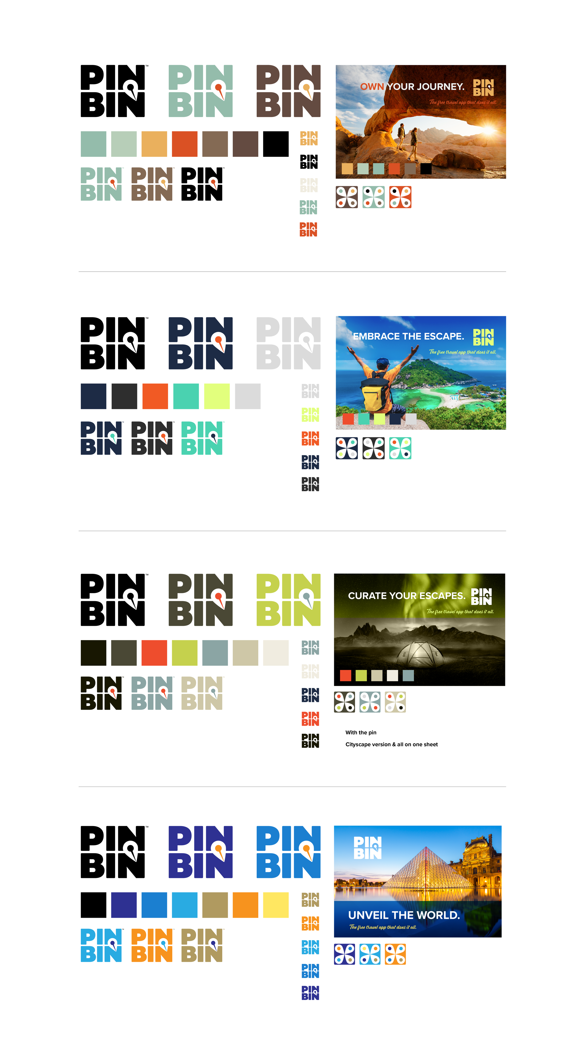
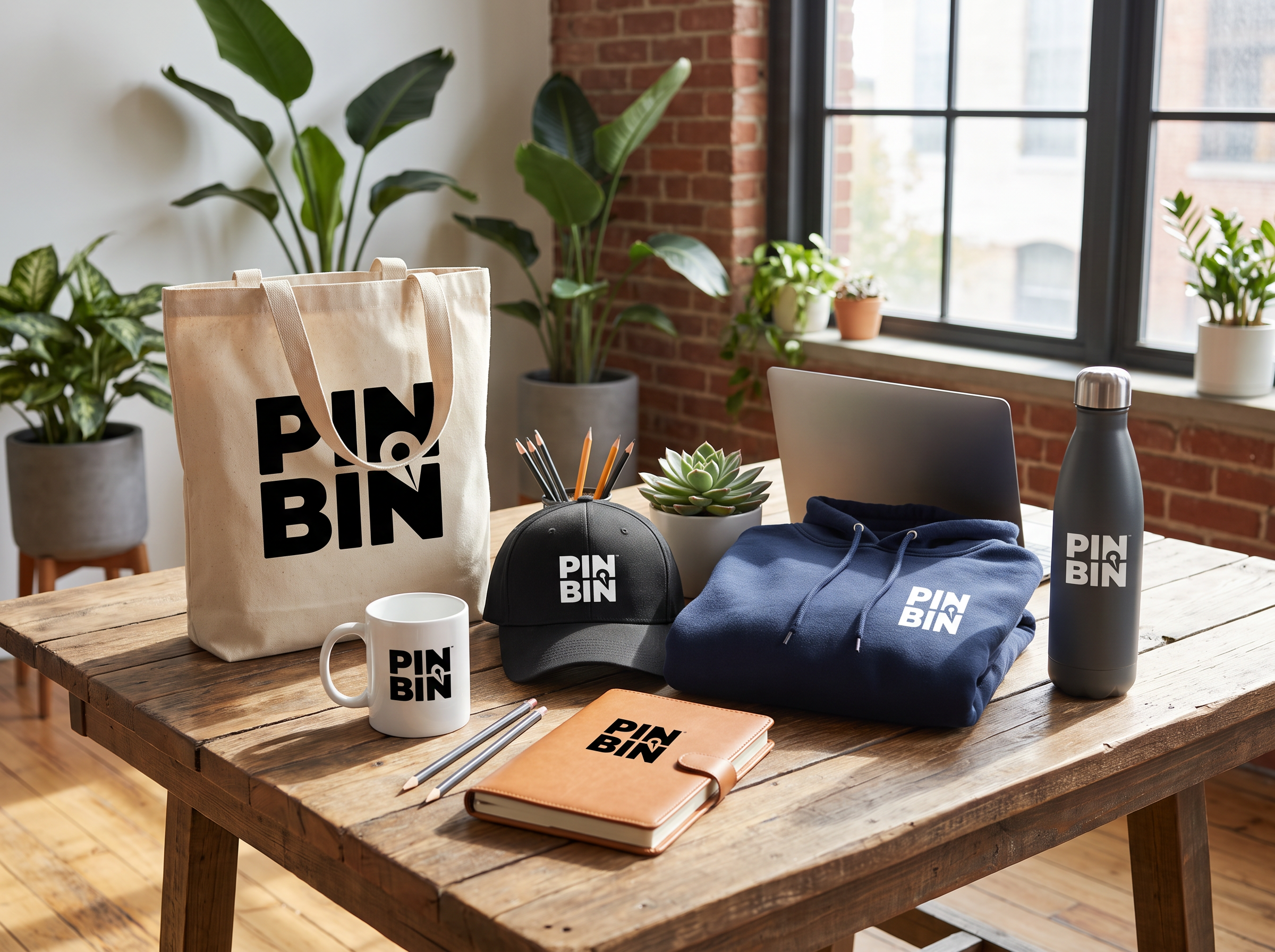
The new PINBIN logo anchors the upcoming travel application launch with a bold, professional visual identity. Designed for instant recognition, the mark cleverly integrates a map-marker and pin reversed out of the clean PINBIN typography. This simple yet sophisticated solution creates a memorable typographic harmony, embodying the app's core mission to help users discover, map, and secure their favorite travel destinations.
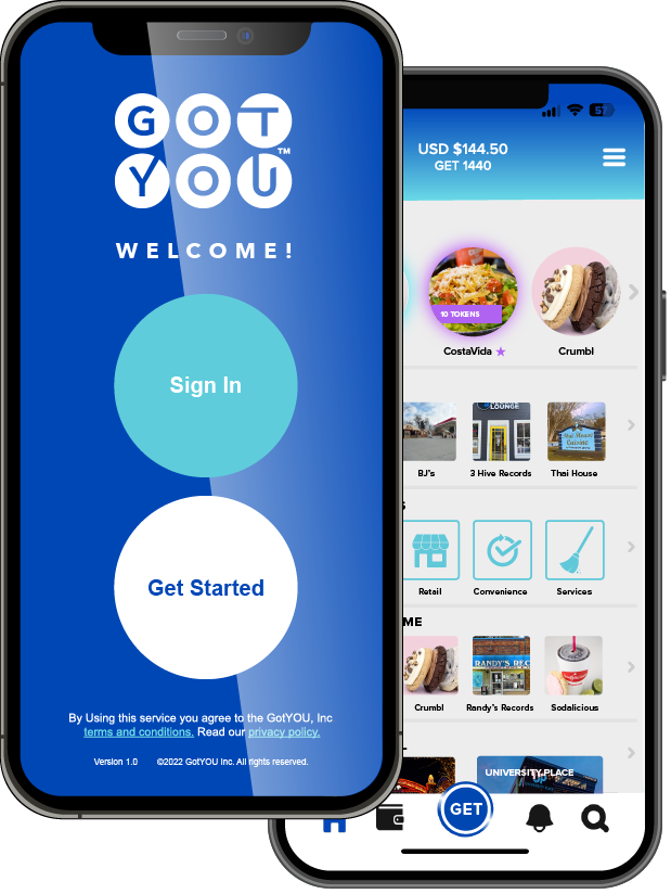


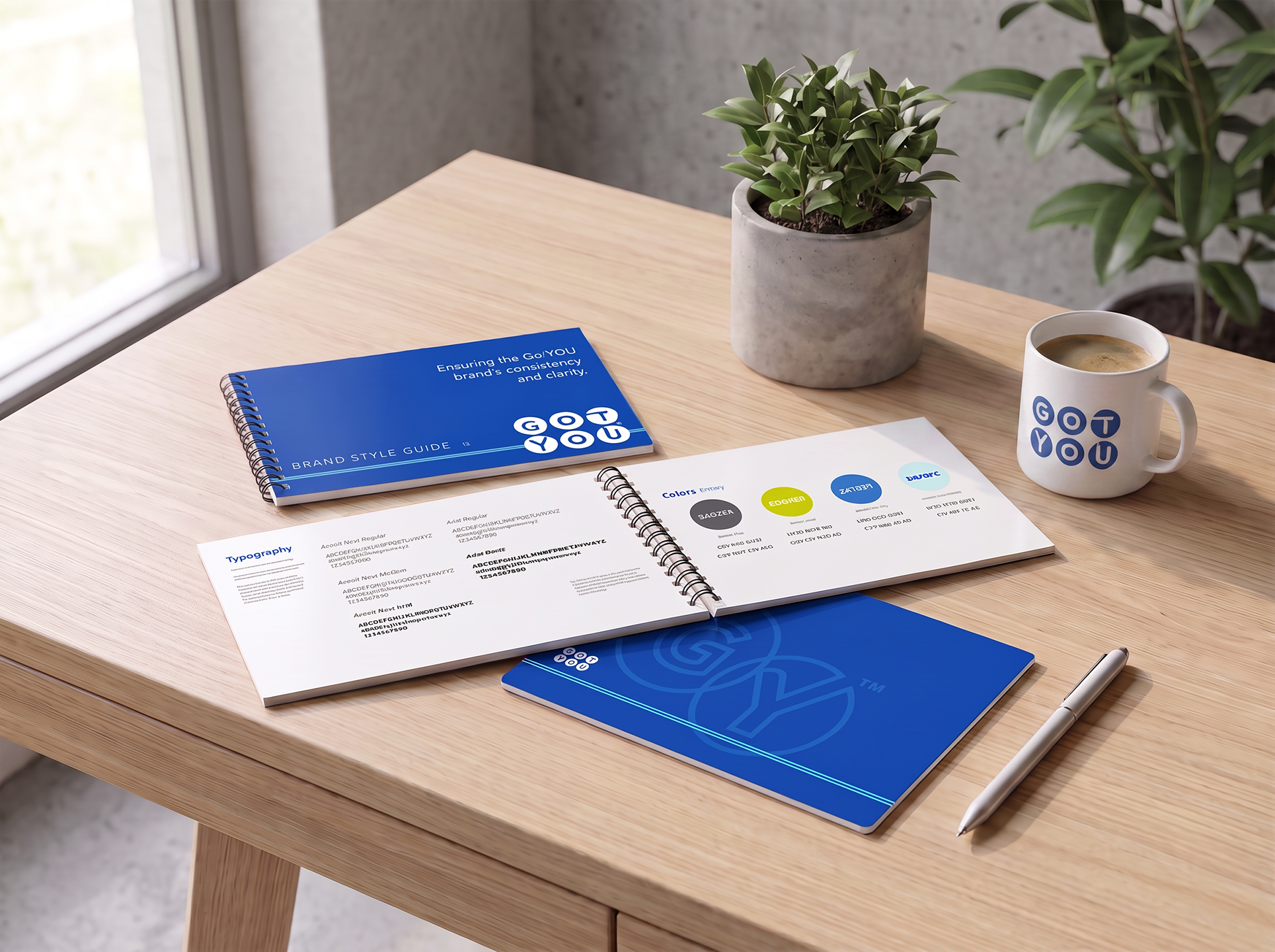

New design work for GOTYOU, a small business app that turns customer points into cold hard cash! Built around a palette of trusted blue, the logo features six custom digital coins encapsulating each letter of the brand name.
For this rollout, I built the entire user experience from the ground up—including the consumer-facing app interface and the backend merchant system UI—to create a loyalty tool that genuinely supports local commerce.
The Freshlime brand

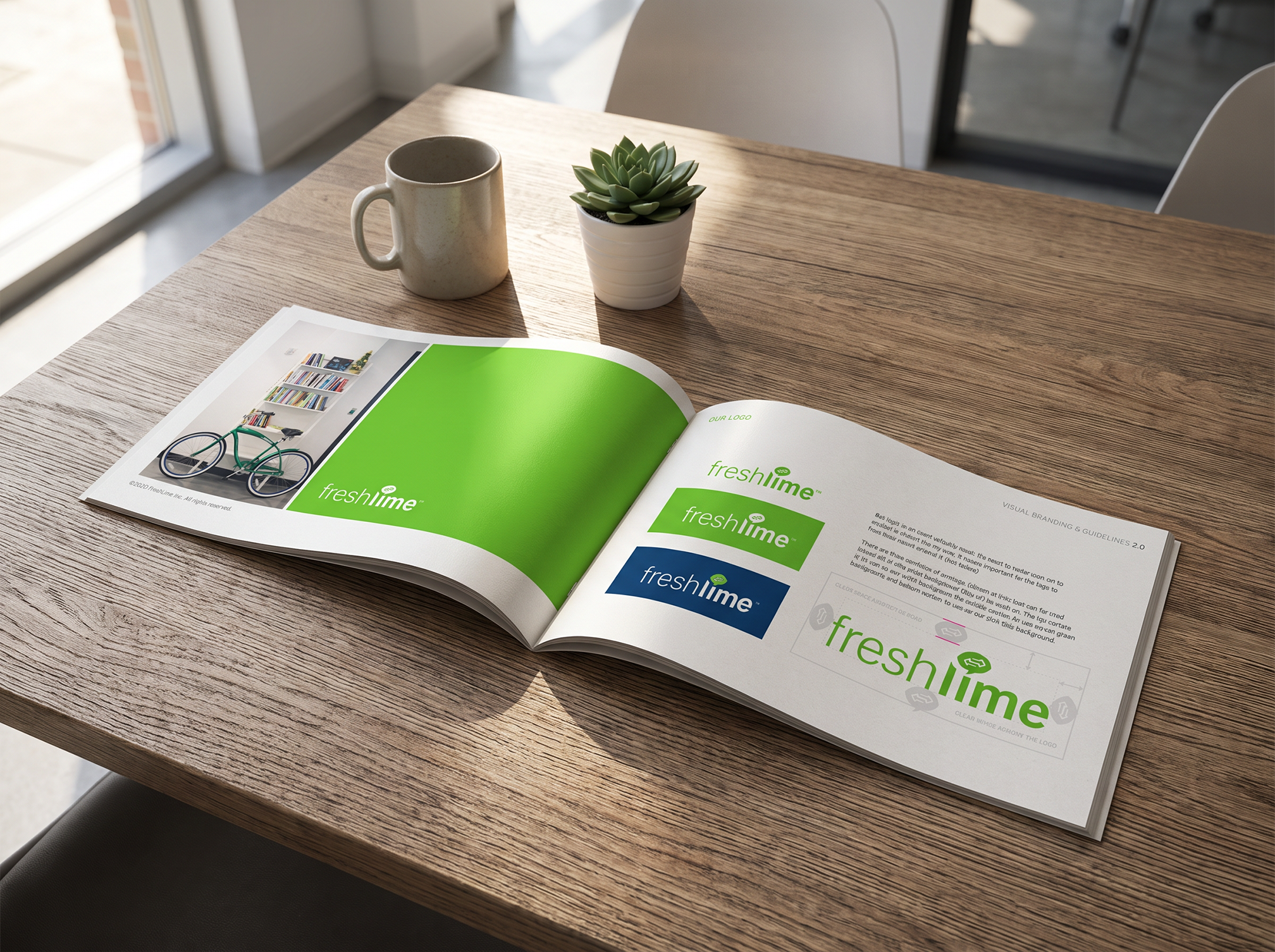
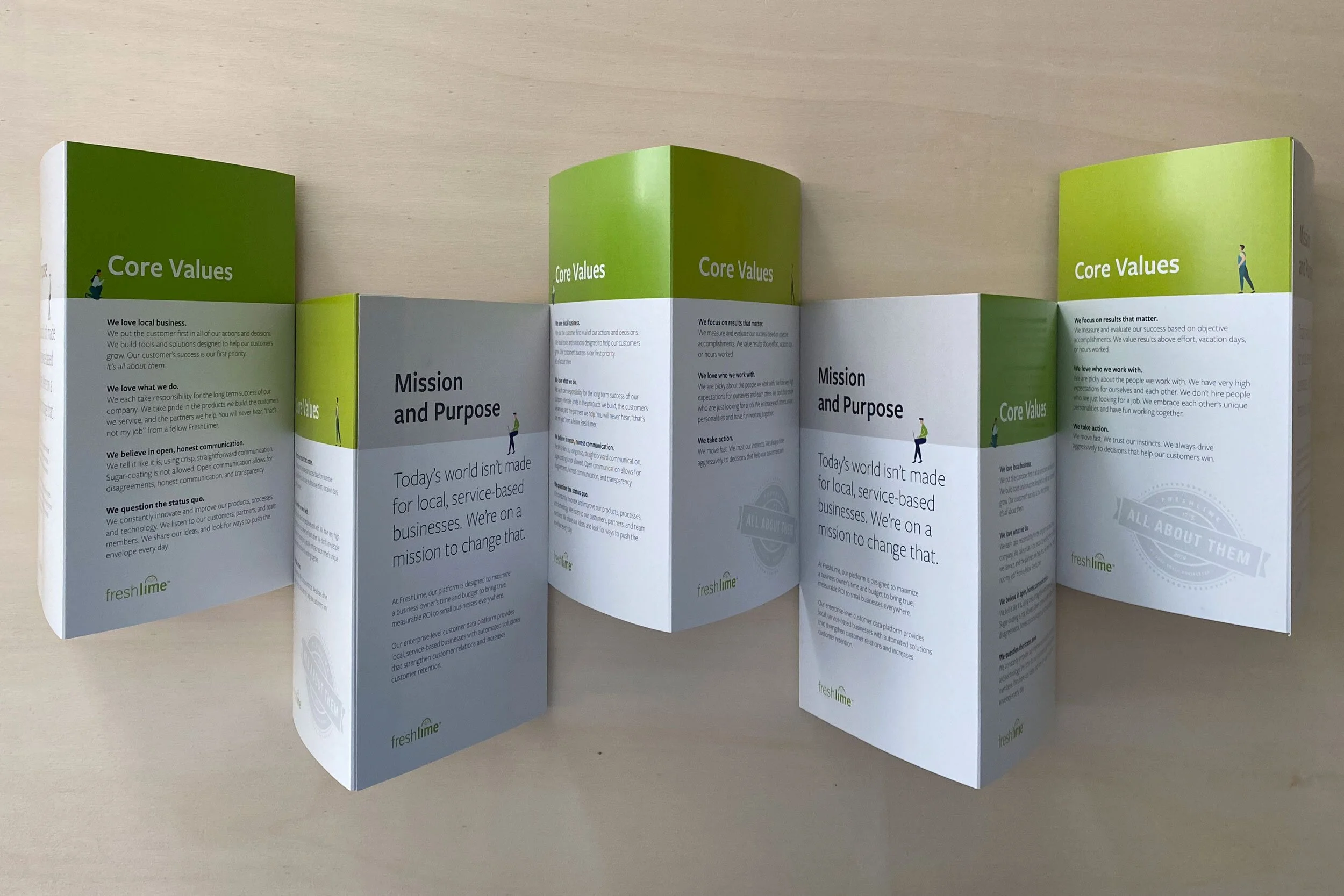
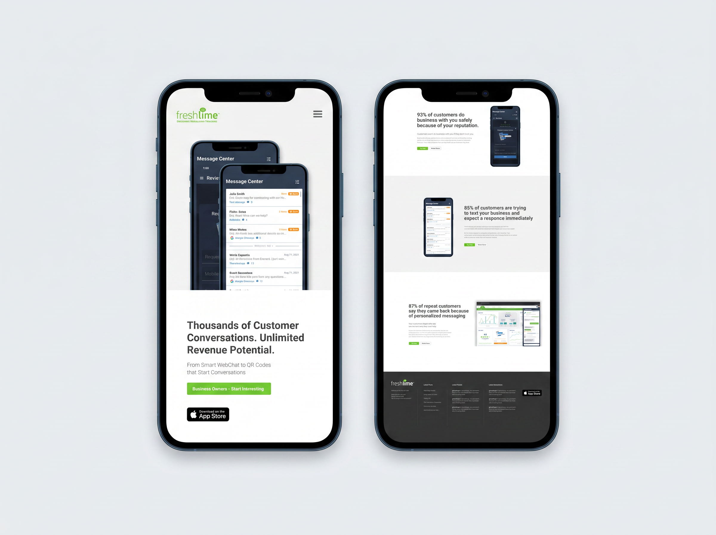
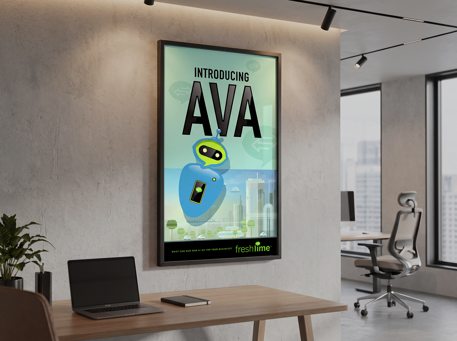
I revitalized FreshLime Marketing’s brand with a fresh, modern approach that perfectly captures their innovative spirit. The goal was to build a vibrant, highly engaging visual identity that commands attention in a competitive marketplace. From a modernized visual system that includes a speach bubble logomark, as well as other collateral, the updated brand signals a bold, forward-thinking evolution for the company.
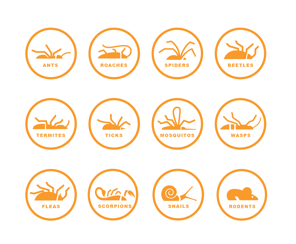
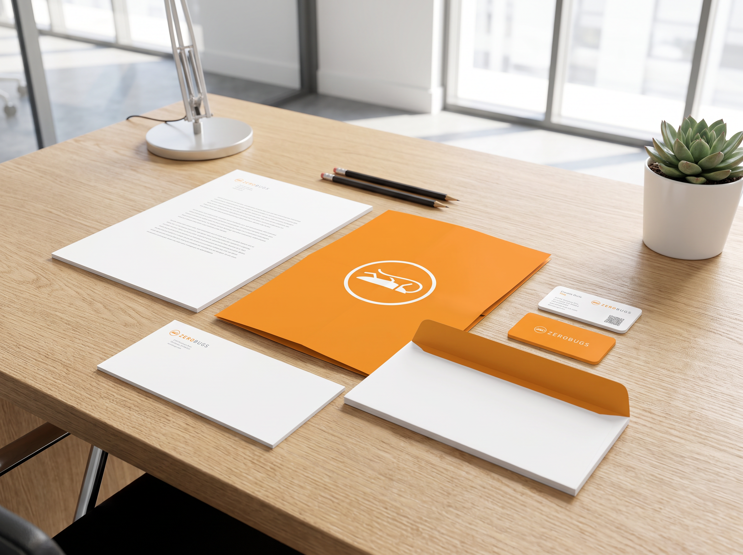

The brand identity for ZeroBugs establishes a fresh, modern presence for an eco-conscious industry challenger. Specializing in the friendliest environmental pest solutions, the visual language balances clinical effectiveness with a warm, approachable tone. The design strategy prioritizes a clean, planet-safe aesthetic that departs from traditional, harsh chemical branding, successfully reassuring customers that their homes are protected without compromising the health of their families or the environment.
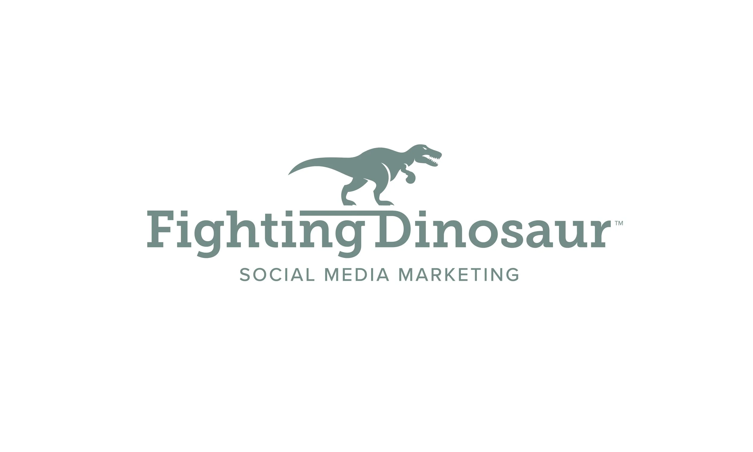
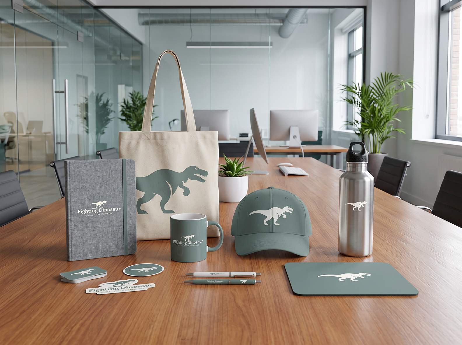
The brand logo design system for "Fighting Dinosaur" delivers a punchy, highly functional identity built for modern digital spaces. Anchored by an organic earth-green palette, the logo mark features a stylized T-Rex wearing boxing gloves, blending playful personality with competitive energy.
The icon balances bold simplicity and memorable character detail, ensuring perfect legibility and visual integrity when scaled down to small sizes on mobile screens or app icons.
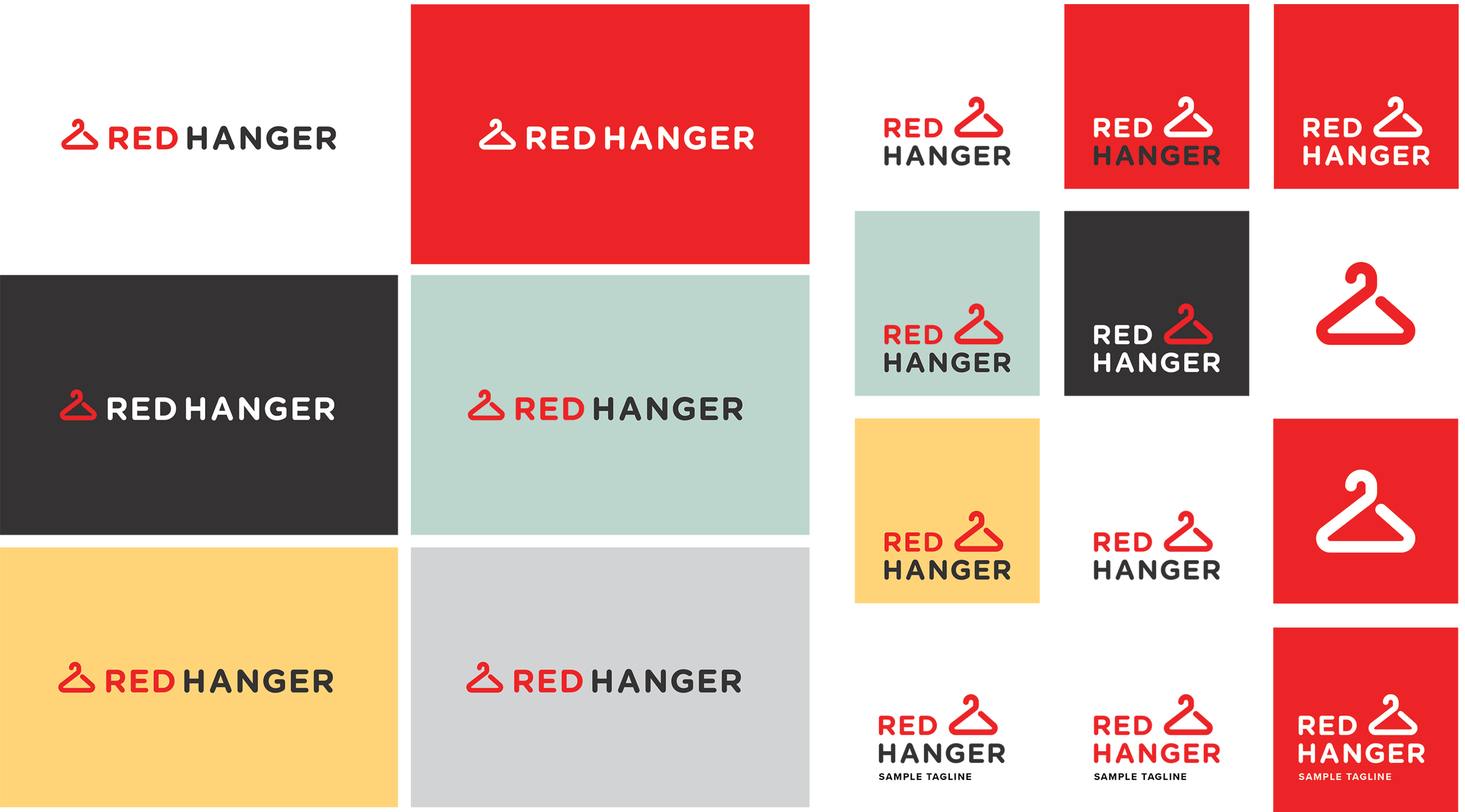

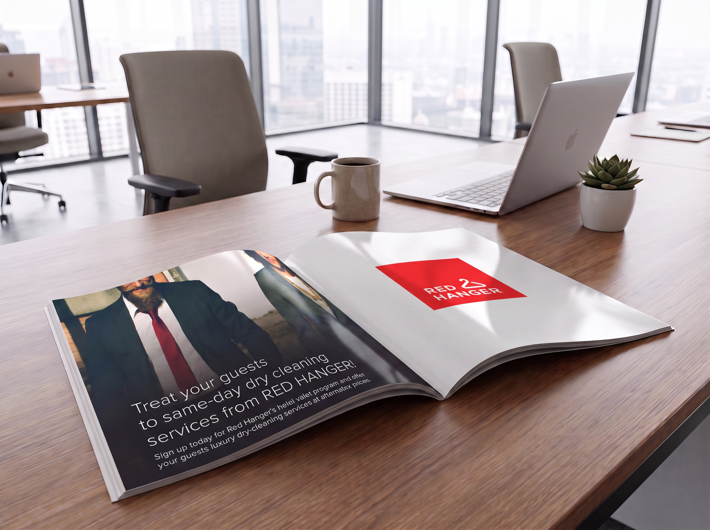
Excited to share this brand update and campaign I hope will be rolled out for Red Hanger Cleaners! I worked on modernizing their iconic logo to give it a sharper, more contemporary feel across all platforms. To launch the updated identity, I designed a high-visibility nationwide billboard and a full-page print advertisement, creating a seamless and powerful visual connection between their updated storefront branding and their print marketing.